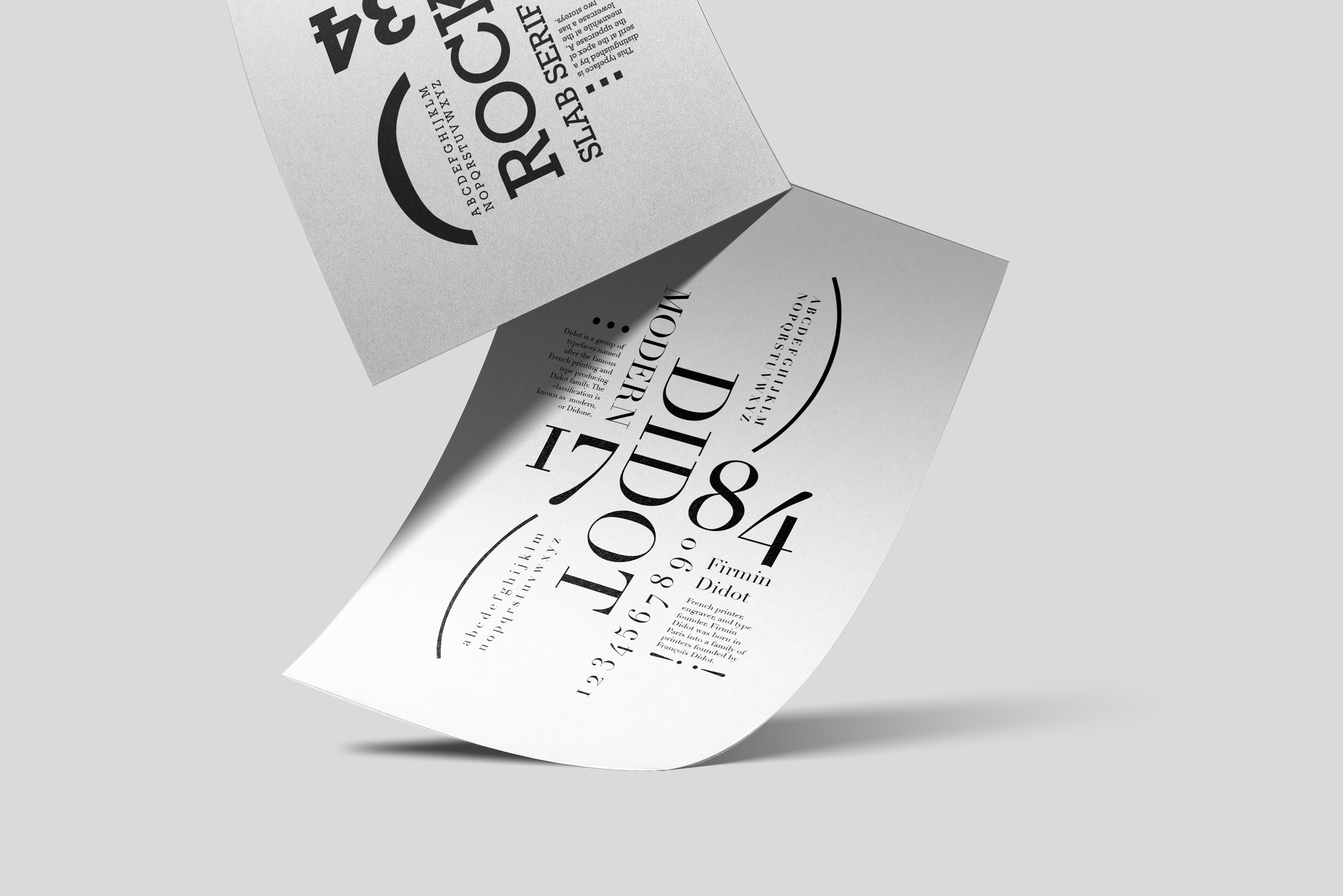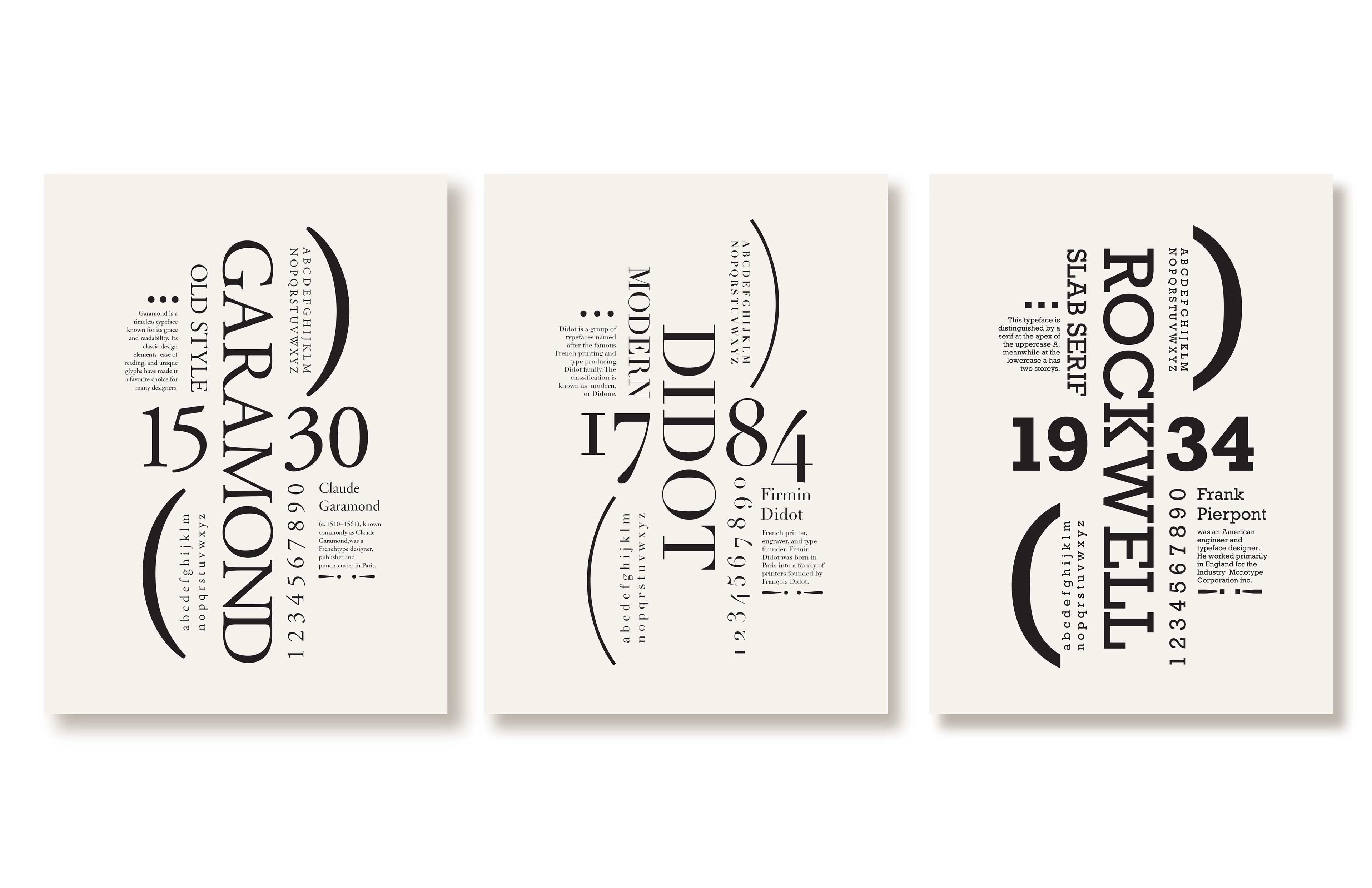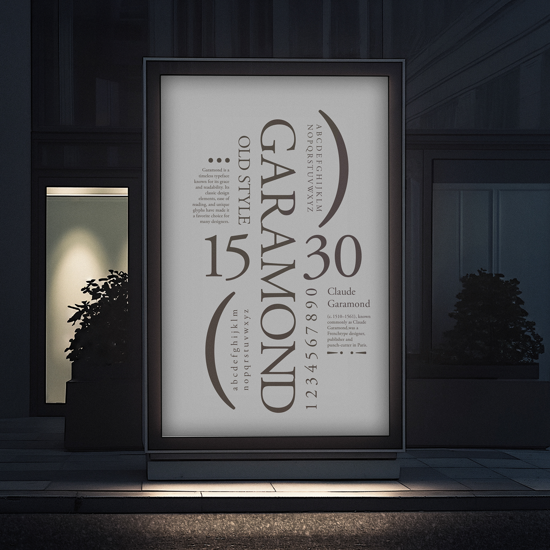
These Typography Posters were created as a series of educational designs exploring the history, classification, and characteristics of different typefaces. I developed a solution that balances learning with visual engagement, ensuring the information is both clear and compelling. The posters feature Garamond, Didot, and Rockwell, using minimalist layouts, strong hierarchy, and thoughtful use of negative space to guide the viewer. Large, expressive type is paired with smaller supporting details to highlight each typeface’s unique personality and classification. This solution is effective because it presents information in a clean, visually engaging way while helping viewers better understand and appreciate typography.