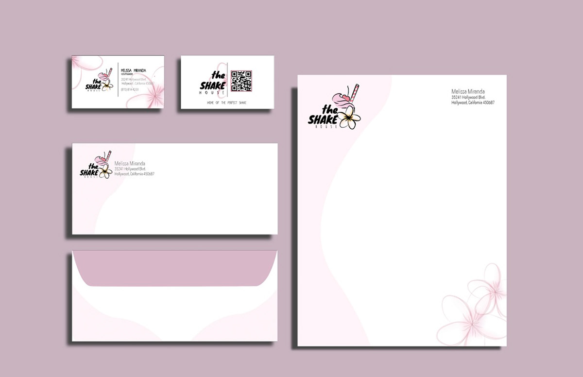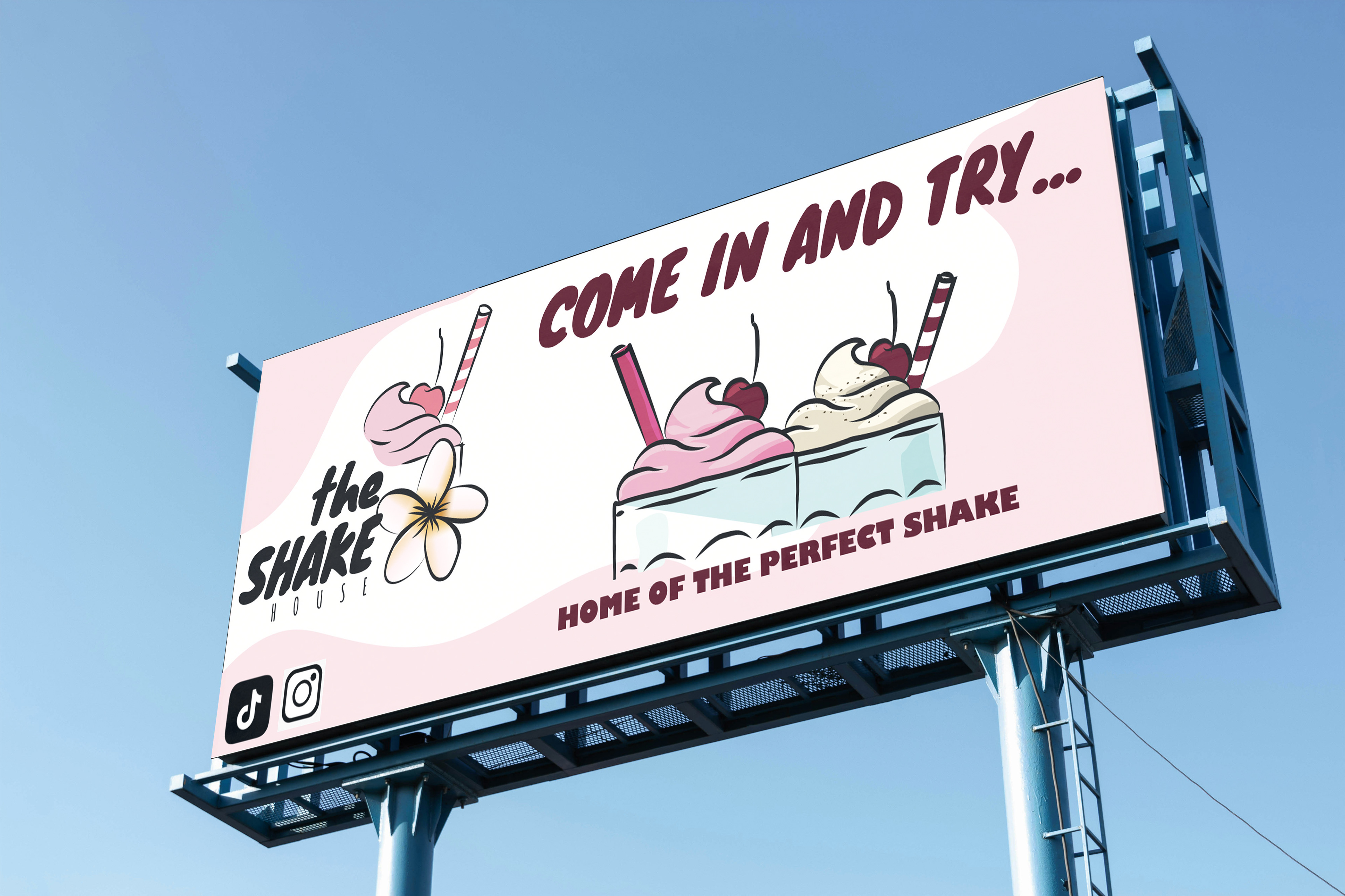
The Shake House was created as a cohesive brand identity for a dessert business, including business cards, stationery, envelopes, and a billboard. I developed a design that feels modern, inviting, and visually consistent across all materials. A soft pink color palette, smooth organic shapes, and a playful milkshake logo work together to establish a recognizable and approachable brand. The clean and simple layout keeps the design professional, while the soft tones and illustrations appeal to a younger, social-media-driven audience. This solution is effective because it balances professionalism with personality, clearly communicating a fun and welcoming dessert brand.